1. Overview
Nespresso is a brand of Nestlé Nespresso SA, an operating unit of the Nestlé Group, based in Lausanne, Switzerland. Nespresso machines brew espresso and coffee from coffee capsules, or pods in bar machines, a type of pre-apportioned single-use container of ground coffee beans, sometimes with added flavorings. The company sells its coffee machine and capsule system from around the world, as well as the VertuoLine system in North America.
2. Problem
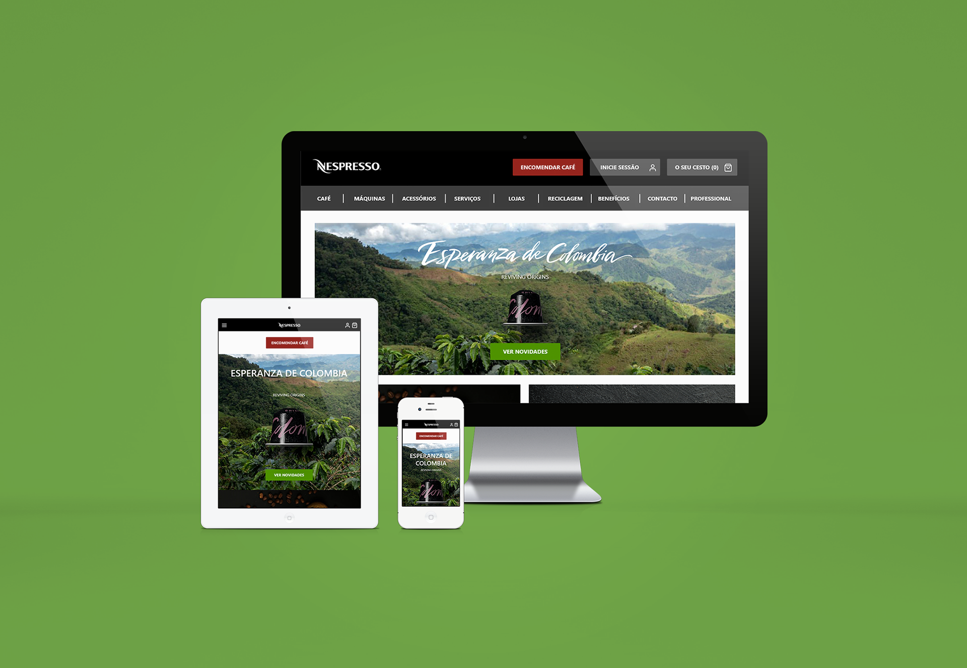
Develop the redesign of the Nespresso website, improving the user experience when buying coffee capsules. For this, the research has as main focus two pages for analysis and redesign: the home and the e-commerce page.
3. Users
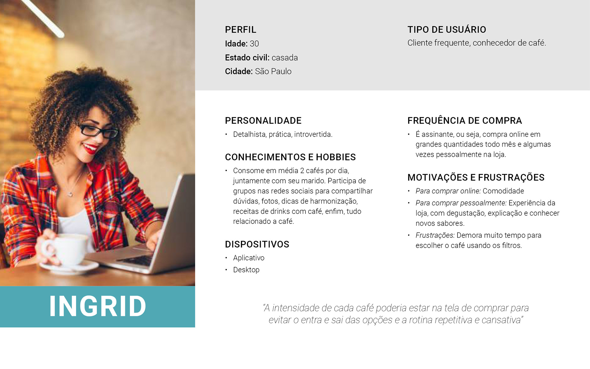
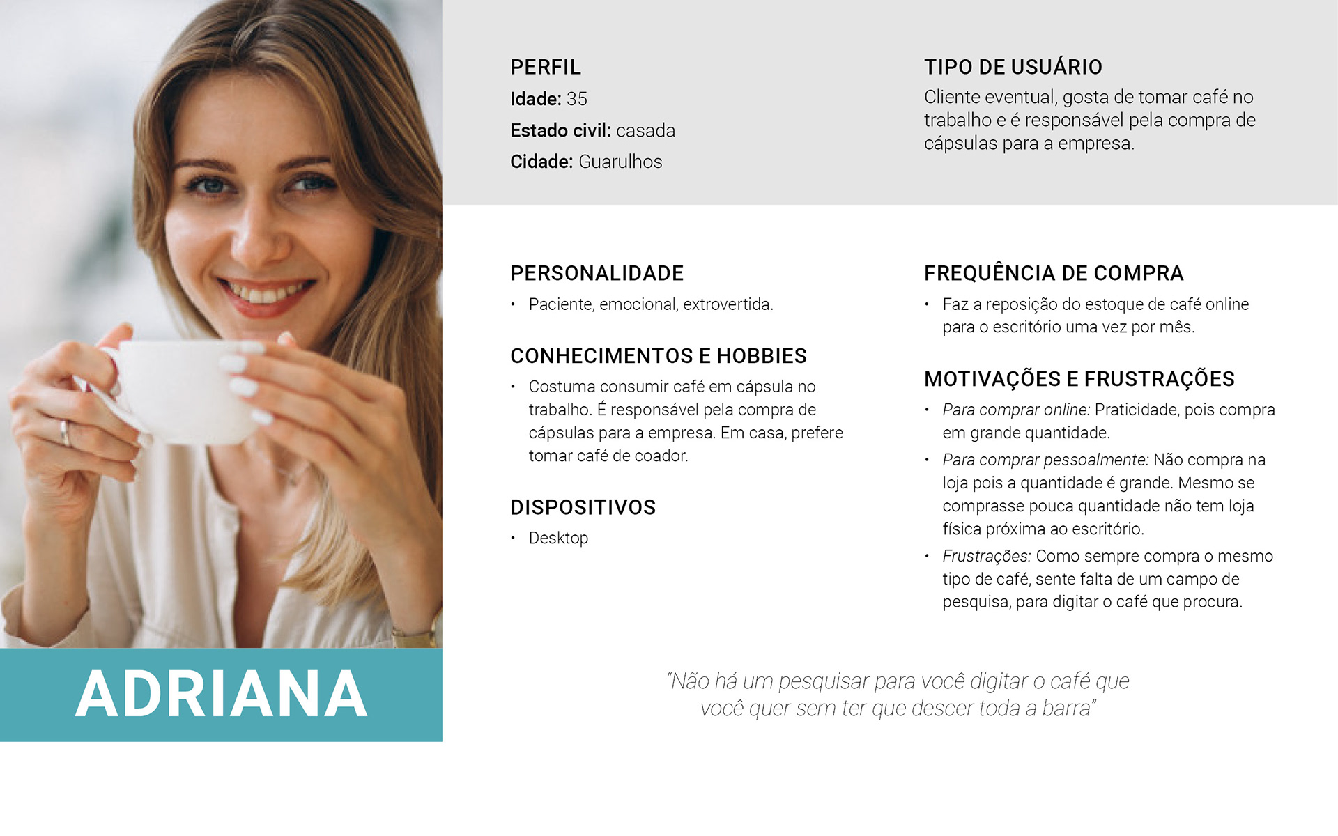
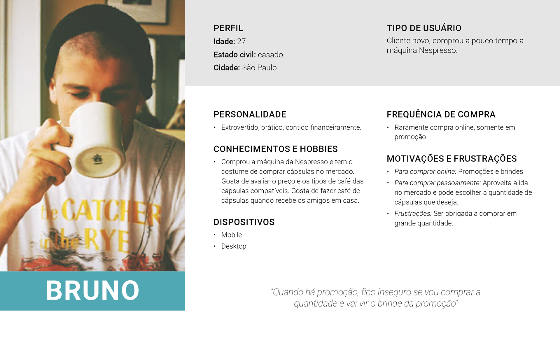
Based on the research described below, it was possible to present three personas.
4. Roles
This is an academic project, so I did it individually. But at each stage there was mentoring and feedback from the course teachers.
5. Scope
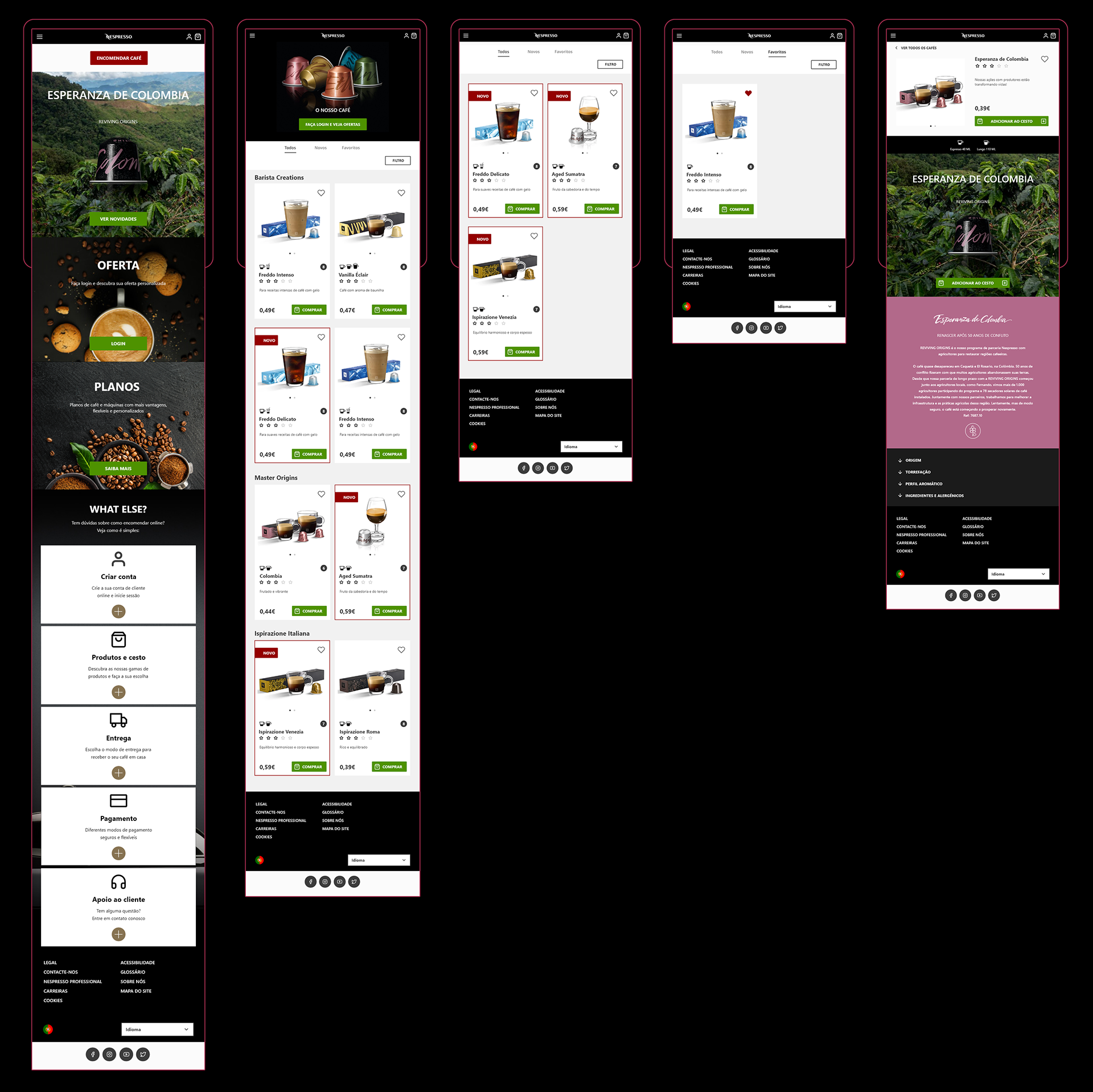
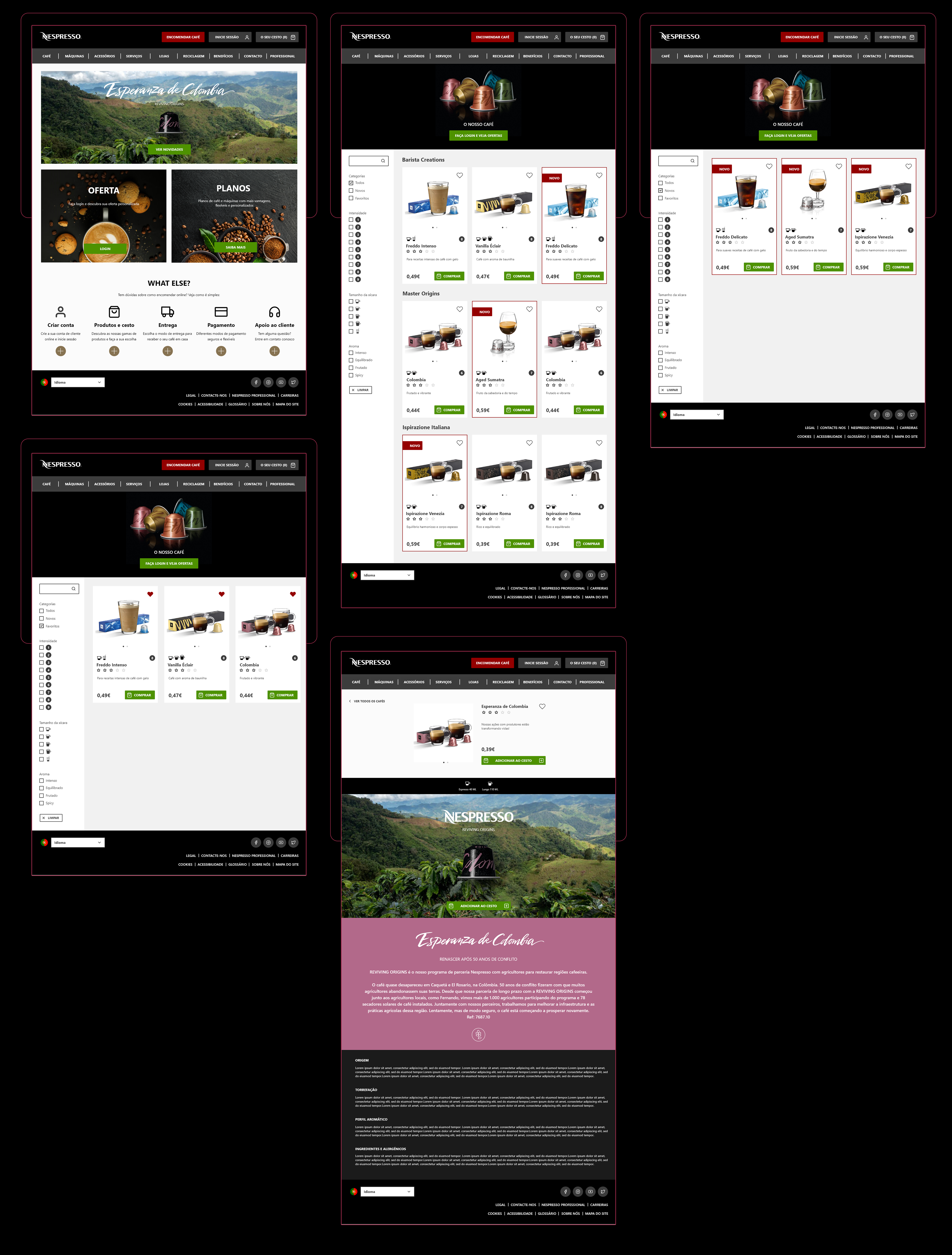
This project focuses on proposing a responsive website, with the concept of mobile first, prioritizing the construction of the mobile interface, and then creating the other devices.
6. Process
I used the Double Diamond process to better split the steps up to the delivery of the UI.

Discover:
• Survey: I did a survey with a small sample of Nespresso customers, with open and closed questions to understand the reason for buying online and analyze possible problems in the purchase process.
• Benchmarking: I observed the main strengths when comparing competitors and other e-commerce.
• Analysis of usability: I observed usability in the mobile and web version, based on Nielsen's heuristics and Norman's Principles.
Define:
Here I present the hypotheses thinking about 3 aspects: what is the problem in the user's view, in the company's view and in the system view.
• In the view of the system:
Based on the comparative analysis of competitors, it is possible to improve the shopping experience with some non-existent features.
• In the user's view:
Improve usage efficiency, making navigation more intuitive and the shopping process more effective.
• In the company's view:
The company wants the customer to have a complete brand experience, to buy more and more over the internet, but to go to the physical store from time to time. In this case, the redesign proposal should not eliminate the user's need to go to the store, but to mix the benefits of online and offline shopping.
Definition:
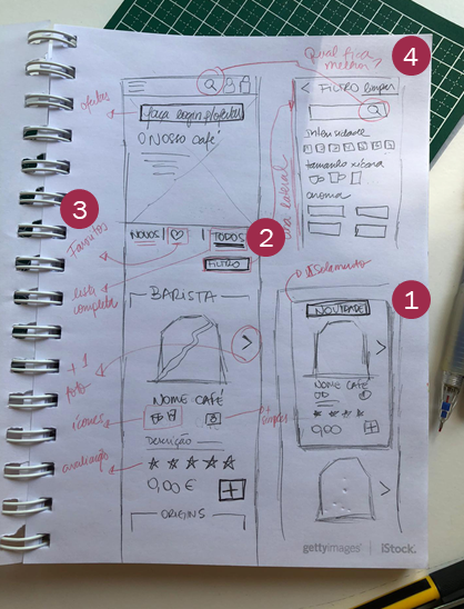
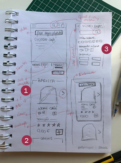
The main objective of the project is solve the following problems:
• lack of practicality in the search for products
• difficulty in visualization and access to new flavors
• lack of continuity in viewing the product page
• difficulty in using the filters
• little visual appeal in product images
• difficulty in visualization and access to new flavors
• lack of continuity in viewing the product page
• difficulty in using the filters
• little visual appeal in product images
User flow:
The ideation of the project will focus on the development of a prototype for the persona Bruno based on his new user journey.
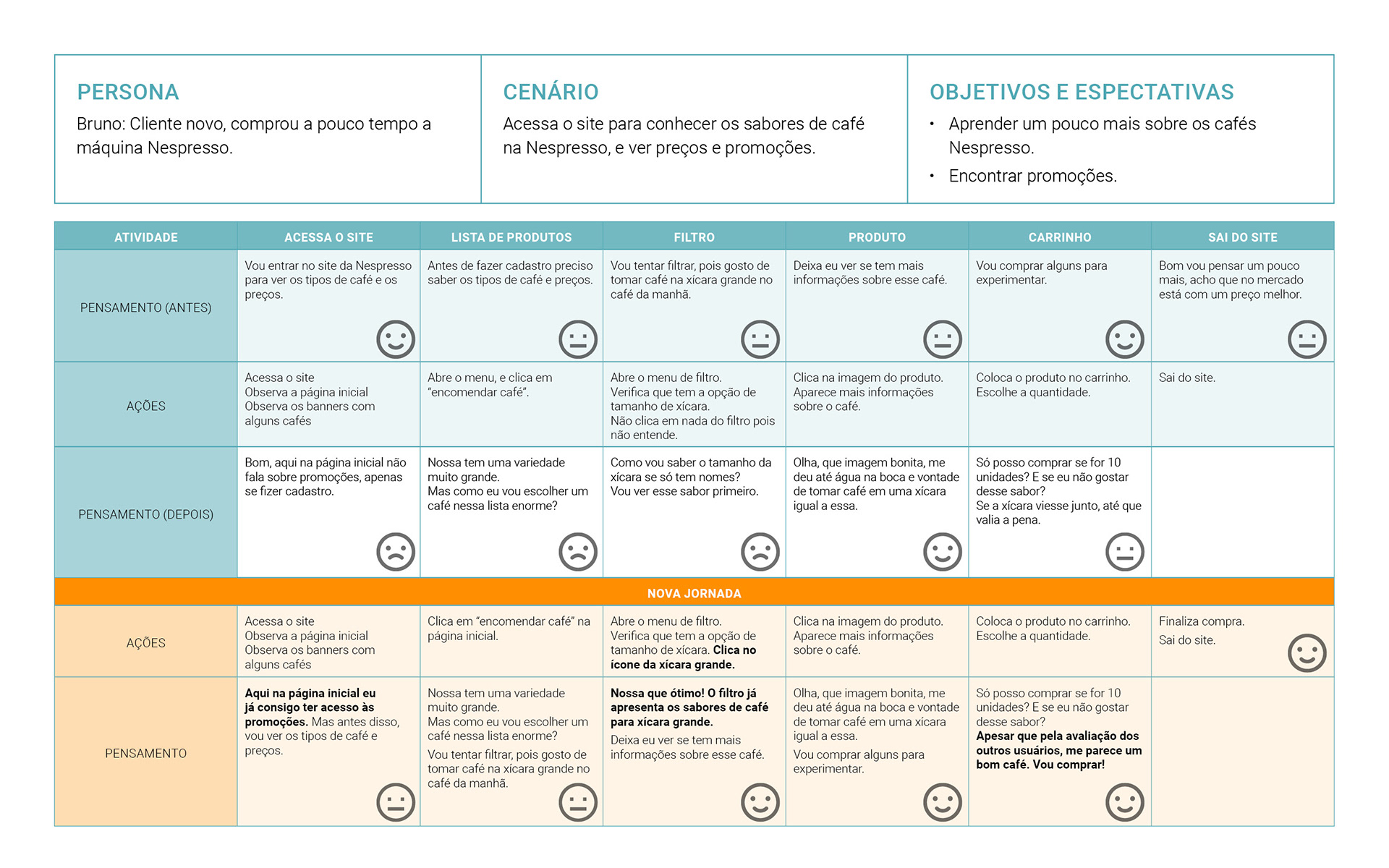
Summary of opportunities according to the users' journey:
• Include button that takes to all new flavors.
• Incorporate filter or highlight for new coffees (Von Restorff insulation effect).
• Continue viewing the page.
• Hit the button "return to coffee" which can confuse the user, as he returns to the complete list of coffee, without the active filters.
• Create favorites list.
• Create search field.
• Make cup size easier to see with icons.
• Work with photographs of the coffee in the product list.
• Incorporate a button to invite the user to register and that has advantages such as a free gift or better promotion price.
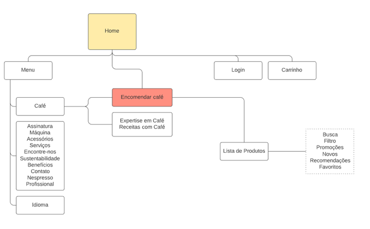
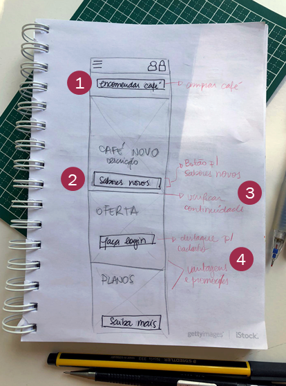
Develop:
Mindmap:
Sketches:
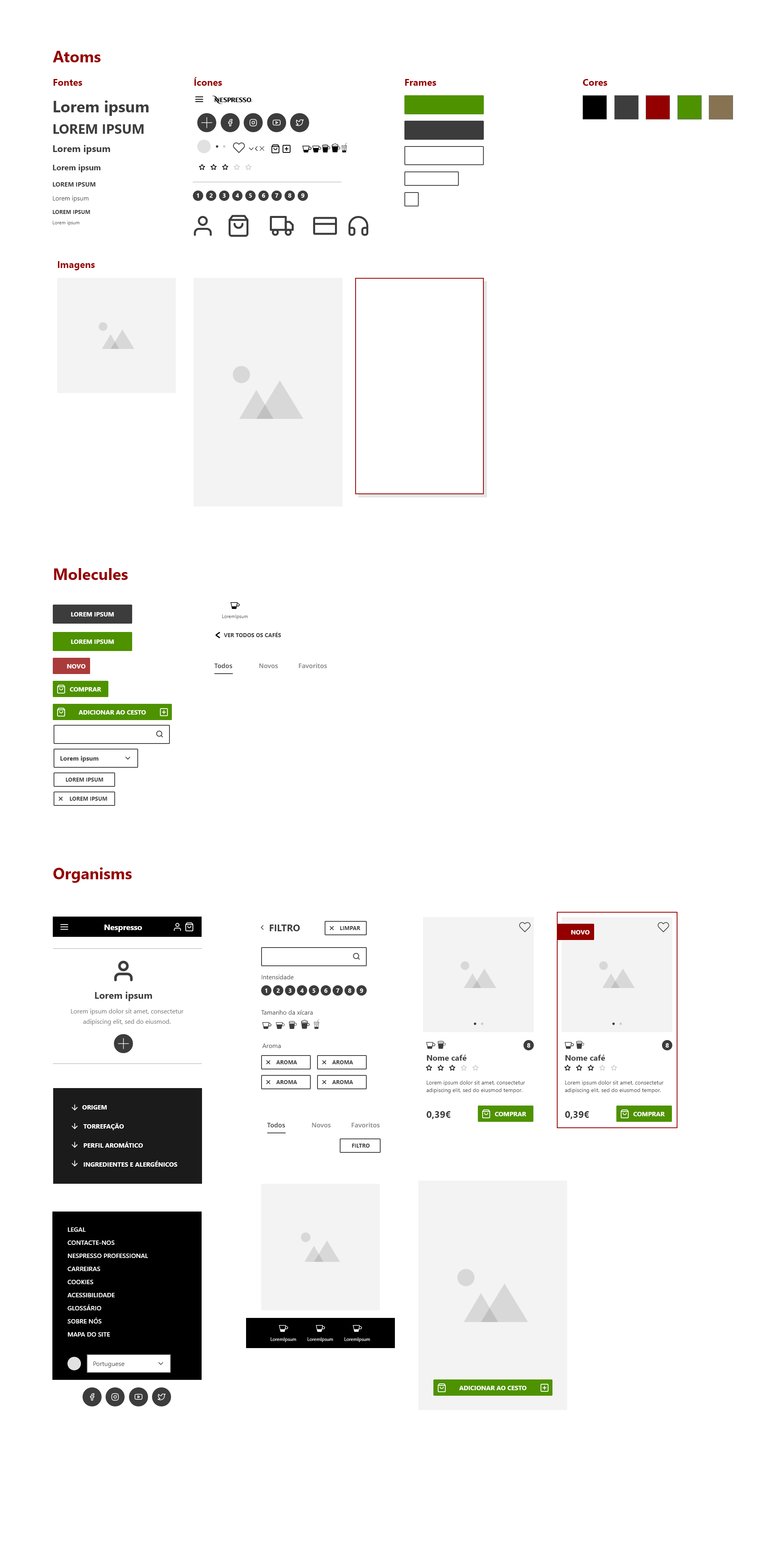
Atomic Design:
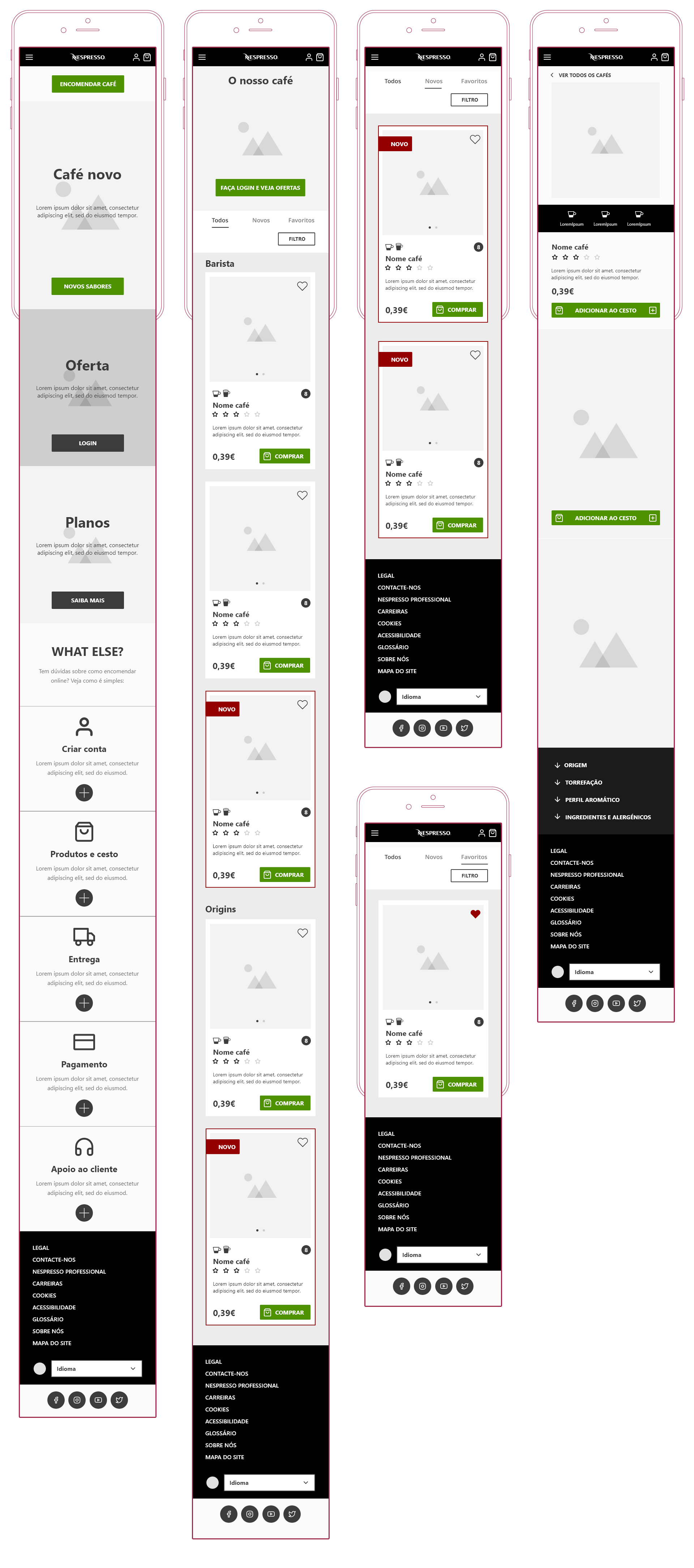
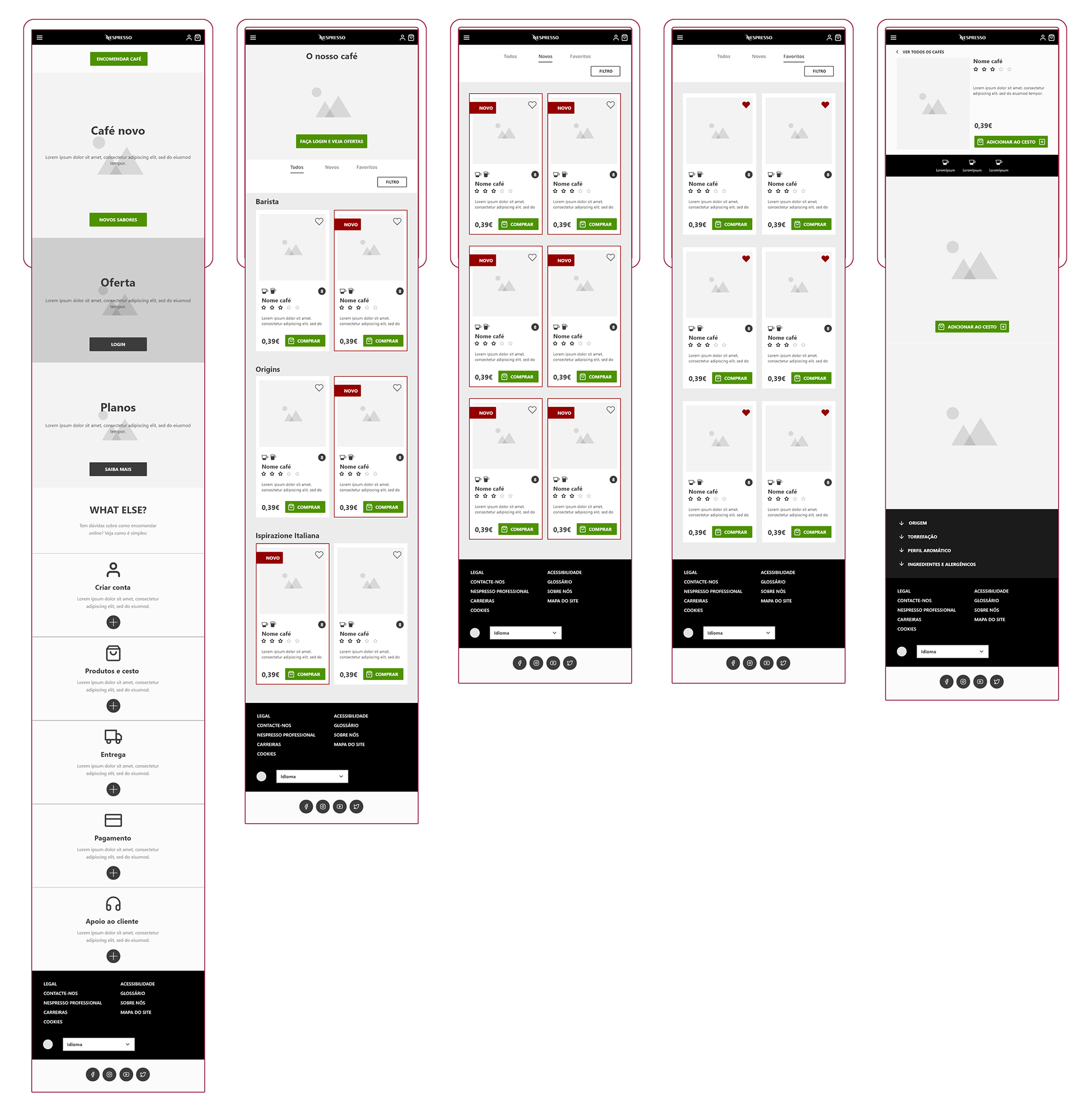
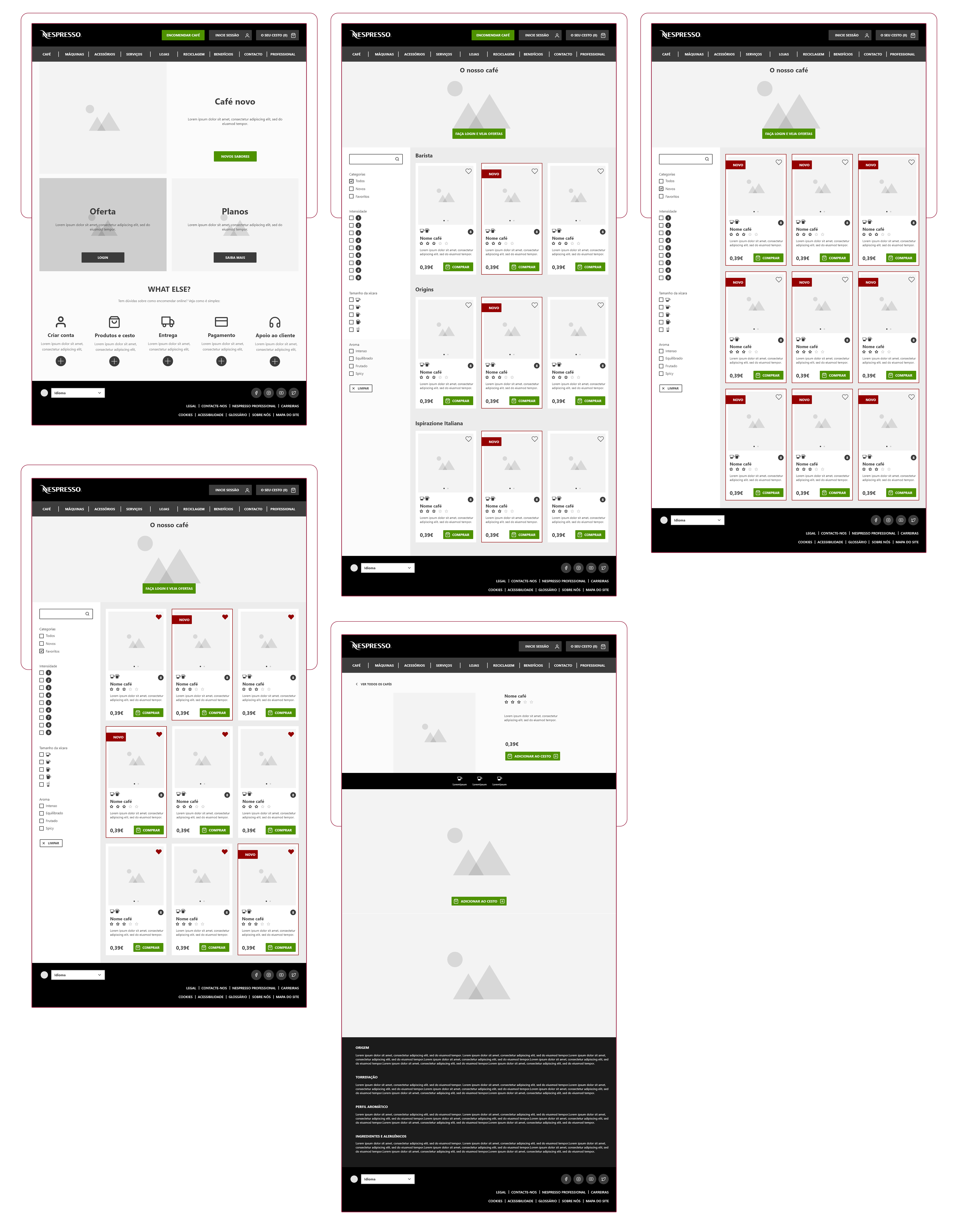
Wireframe:
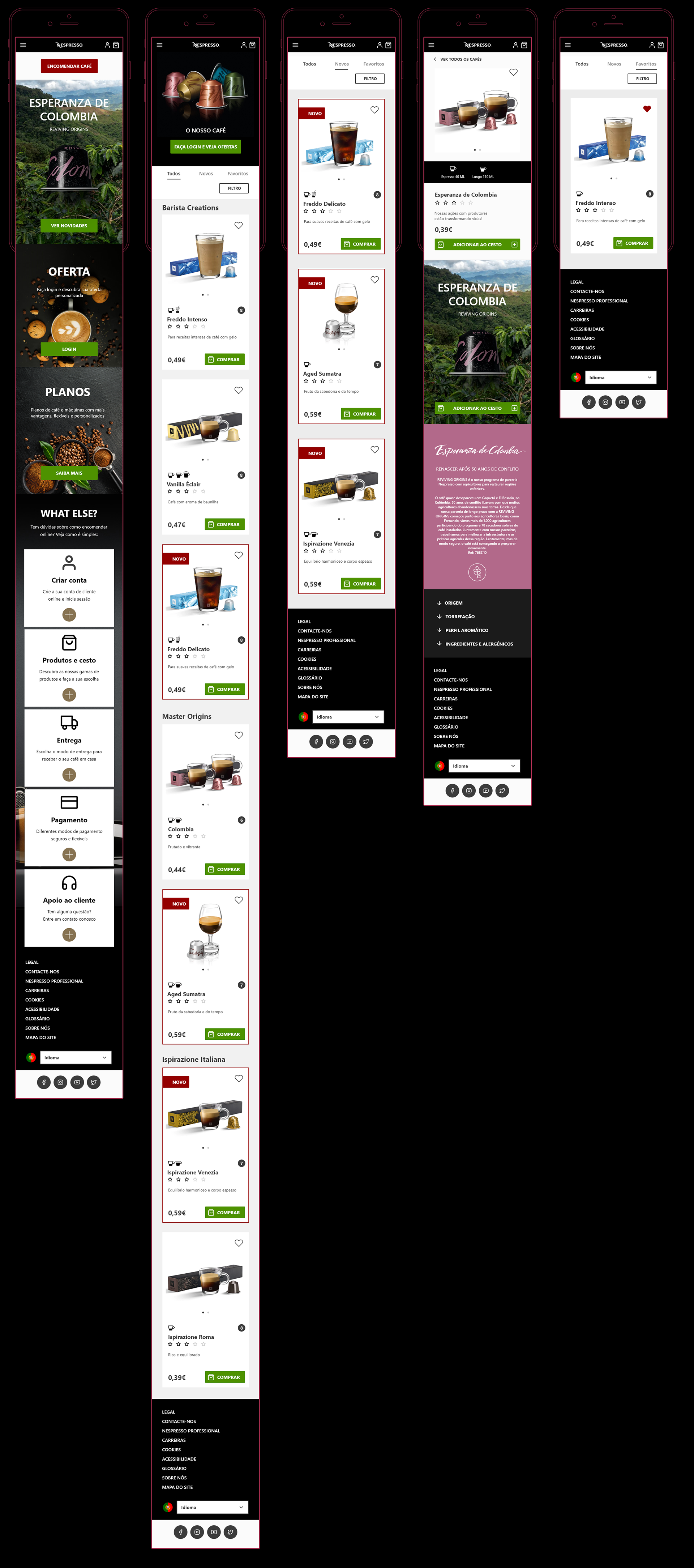
Prototype:
Delivery
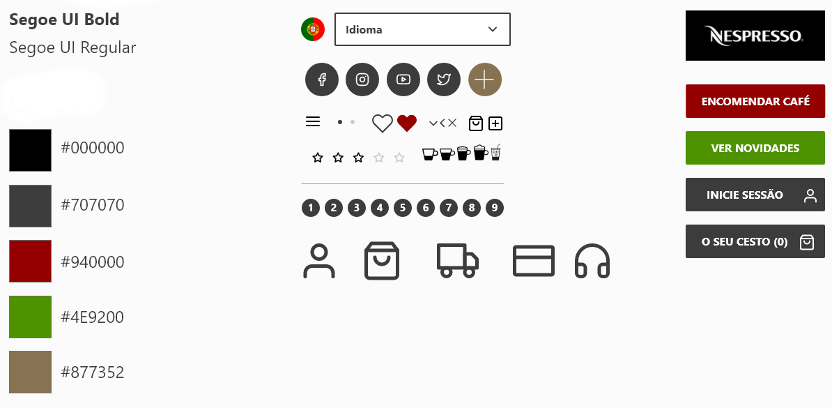
Style Guide:
UI DESIGN
Skills:
Adobe XD • Photoshop • User Experience • User Jorney • Wireframe • UI Design • UX Design